Financial Platform.
A trading platform with every piece of data. And no idea what to do with it.
The Problem
The platform had built two decades of features. It hadn't built a point of view.
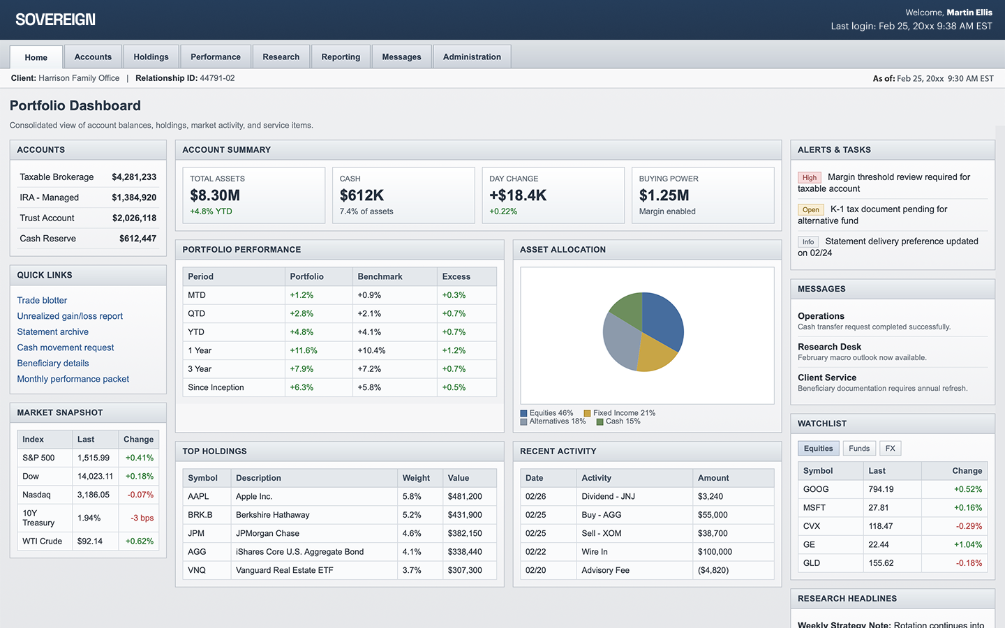
A financial trading and portfolio platform had accumulated the full institutional toolkit: screeners, holdings dashboards, performance reporting, watch lists, account summaries, market snapshots, buying power, day change, top movers, recent activity, message centers, administration tools. The data was complete. The features were credible. Each one had solved a real problem when it was built.
The cumulative effect was the opposite of intelligence. Traders logged in and were shown everything that could matter, with no system for naming what did matter. Decisions waited on reconciliation across screens. Conviction depended on individual memory of where the real version of anything lived.
The opportunity wasn't a redesign. It was a philosophical shift: stop building a platform that displayed data, and start building one that produced decisions.
Before
A trader's first question - "what should I do right now?" - was the only question the platform refused to answer.
The same data lived in three places, but only one of them was actionable, and there was no way to tell which from the interface. Patterns conflicted across screens. Sources of truth multiplied. Every decision required a small archaeology - which dashboard is right, whose version is current, what dependency am I missing.
Verification became the work. The platform was full of features and empty of direction.
The Shift
The reframe was structural, not visual. The question wasn't "how do we redesign the dashboard?" It was: what is this platform actually for?
A trading platform isn't a data store. It's a decision engine. Every screen, every signal, every alert should exist to move the user toward an action - buy, sell, hold, watch, wait - or it shouldn't be on the screen at all. Information that couldn't be acted on was noise dressed up as intelligence.
The reframing question became: What if every surface in the platform answered the same question: what does this trader need to do next, and why?
The System
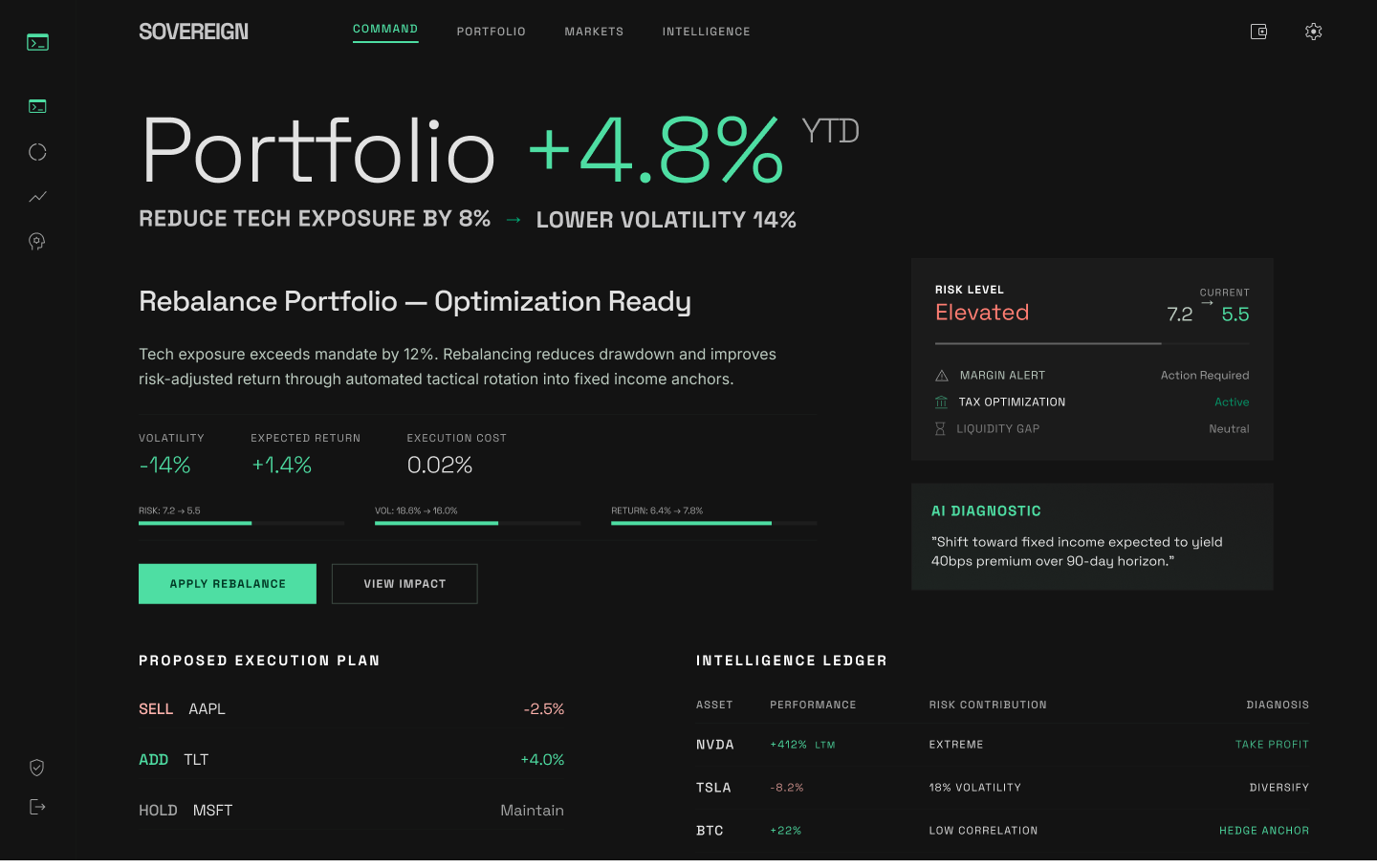
The platform was rebuilt around three principles: anticipate the next action, eliminate redundant verification, and make the system trustworthy enough that users would stop checking it twice.
Intelligence became the spine. Signals were weighted by relevance to the moment - a metric that mattered at market open might be irrelevant by midday, and the platform now knew the difference. The same signal could surface differently depending on the trader's portfolio, exposure, and context.
- Next-action surfacing - the platform led with the decision the trader was likely arriving to make, not the data they'd have to assemble to make it
- Signal standardization - every metric meant the same thing on every screen, ending the practice of cross-referencing to confirm what a number was actually telling you
- Single source of truth - parallel data paths were eliminated; the system named one canonical version and made it visible everywhere
- State, context, consequence — every signal arrived with the surrounding information needed to act on it, so users stopped having to reconstruct context from scratch
The dashboard didn't shrink. It sharpened.
After
The platform became something traders could trust to surface what mattered - instead of something they had to interrogate to find it.
Less time was spent assembling, validating, and reconciling. More time was spent executing. The product moved from being a set of capable but uncoordinated tools to being a stable foundation for high-stakes work under time pressure.
Less to verify. More to act on.
Energy & Infrastructure.
A community solar company that thought it was selling green. It was selling $30 a month.
The Problem
The company had built a portal full of features no customer was using - and was spending heavily on ads that spoke to no one in particular.
A mid-sized community solar provider was running residential sign-ups across the U.S. with a dashboard packed with leaderboards, neighbor referrals, "go green" badges, solar farm photos, weather overlays, comparison charts, and credit explainers. Marketing was running generic Facebook ads — solar panels on roofs, be an earth champion — and trying to teach the country what community solar was.
Sign-ups were soft. Churn was a constant fight. The team's instinct was to add more — more education, more gamification, more dashboard features, more reasons to come back to the portal.
The diagnosis was the opposite. They weren't building too little. They were building around the wrong product.
Before
Customers arriving with one question — "will this save me money?" — were routed through a product that wanted to teach them about photovoltaic credit allocation.
The portal had leaderboards ranking neighbors by savings, "support the earth" badges, suggestion flows to enroll your friends, weather widgets showing how sunny it had been, and comparison charts justifying the math. The marketing told them solar was good for the planet. The sign-up flow assumed they wanted a community.
They didn't. They wanted thirty dollars off their electricity bill, automatically, forever, with nothing to manage. The product was wrapped in everything except the thing customers had actually come for.
The Shift
The reframe came from North Star work that named what the company was actually selling — and what it wasn't.
Customers weren't buying green. They weren't buying community. They weren't buying education. They were buying a sign-up bonus and roughly thirty dollars a month, forever, with zero ongoing effort. Every feature the team had built to "engage" customers was friction added to a transaction the customer wanted to complete in two minutes and never think about again.
The reframing question became: What if the entire product was "sign up once, save money, forget about it" — and intelligence did the work of finding the right person and reassuring them it was working?
The System
The portal came down. In its place: a stripped sign-up flow and a small monthly push notification that did the only job that mattered after enrollment — confirming the money had arrived.
Upstream, AI handled what the old generic ads couldn't: targeting and narrative.
- Audiences segmented by region, then state, then income and generation — Miami didn't respond to what worked in Salt Lake City, and a generic ad couldn't bridge the gap
- Ad hooks led to AI-generated landing pages that told a tailored story — because people sign up for narratives, not pitches
- The sign-up flow was reduced to the minimum number of steps the regulator allowed
- Post-enrollment, customers got one push per month: "You saved $32 this month." No portal visits required
The dashboard most companies would have doubled down on was the thing that needed to to be streamlined.
After
Sign-ups went up because the ads finally spoke to the person seeing them. Churn went down because customers got monthly proof the product was working without having to log in and look.
The team stopped fighting retention with engagement features and started letting the product be what it was: a quiet, automatic discount on a monthly bill.
Sign up once. Save money. Forget about it.
Research & Intelligence.
A credit ratings platform that thought it needed more features. It needed eleven different products.
The Problem
The team was building a single dashboard for an audience that didn't want one.
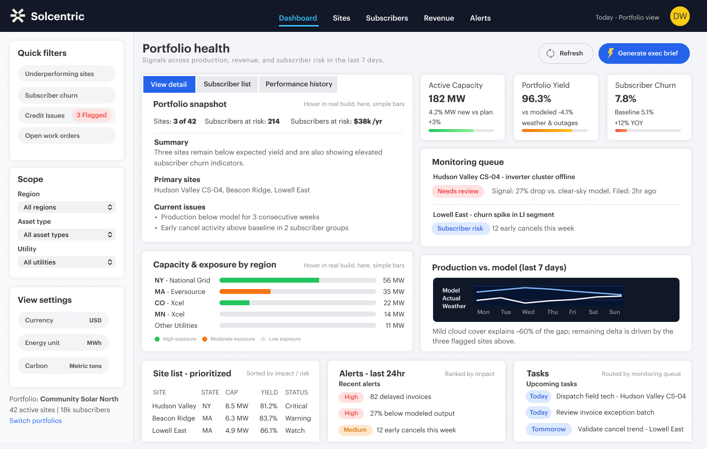
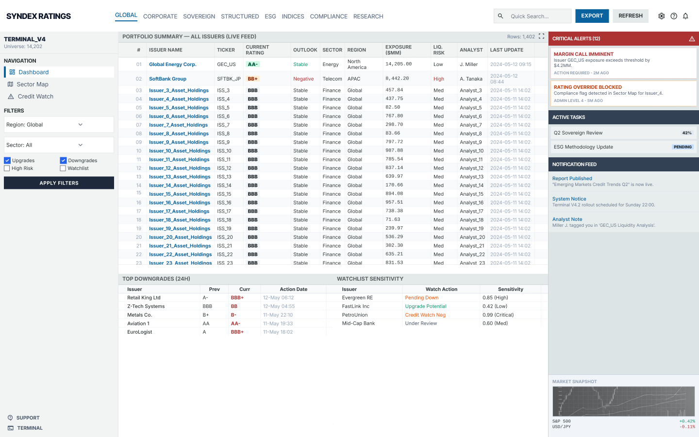
A major credit ratings and market intelligence platform had accumulated the full toolkit of institutional research: sector maps, credit watches, analyst videos, research libraries, alerts, notifications, gainers and losers, screeners, comparison tools. Every feature was credible. Together they read like a restaurant serving Indian food, kebabs, pizza, and ice cream sundaes - technically a menu, functionally a mess.
The team's strategy was the one most teams default to: match the competitors' feature list, then exceed it. The diagnosis was that the product was behind. The diagnosis was wrong.
The issue wasn't intelligence scarcity. It was decision friction.
Before
Eleven different kinds of users were arriving at one dashboard hoping it would somehow be built for them.
Executives logging in to understand "what's moving the market today" were dropped onto the same homepage as analysts running deep sector research, as portfolio managers checking exposure, as journalists hunting for a quote. Ratings, research, conviction signals, and sector dynamics existed as separate outputs - reports, tables, alerts - across disconnected tools. Each was credible alone, fragmented together.
Analysts spent disproportionate time assembling and formatting. Clients consumed insight through static PDFs - often stale by the time they were read. Critical changes existed in the data; they just surfaced too late, or without enough surrounding context, to drive a decision.
The product was full of intelligence and empty of timing.
The Shift
The reframe came from a single question the team had never asked: who, specifically, is arriving today, and what decision are they trying to make?
AI-driven analysis of usage patterns surfaced eleven distinct roles arriving at the platform - each with a different reason for being there, a different definition of "useful," and a different threshold for what counted as a signal. An executive scanning for market themes had almost nothing in common with an analyst building a sector thesis. Yet both had been landing on the same homepage.
The reframing question became: What if the platform stopped being one product trying to serve everyone, and became eleven products - each one configured around the decision its user came to make?
The System
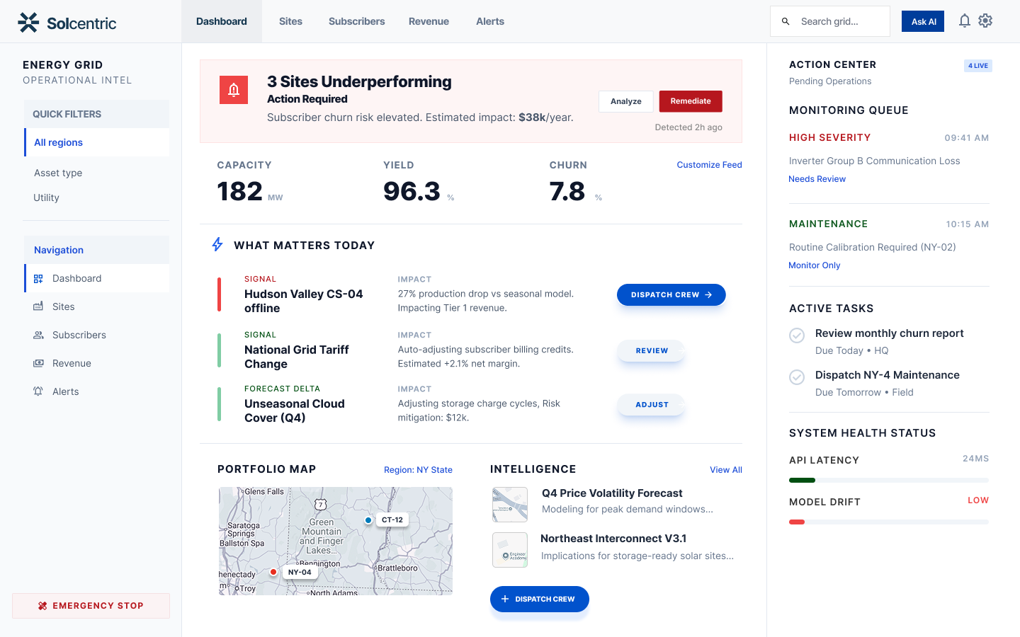
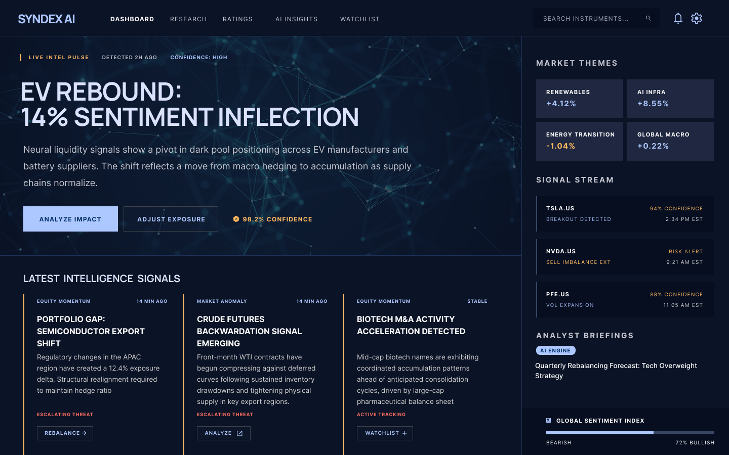
The platform was restructured as a decision engine, not a search engine. The same underlying intelligence - ratings, conviction, sector signals, news flow, analyst output - surfaced differently depending on who was arriving and what they were trying to do.
- Latest Intelligence Signals - a market-themes layer that read news, ratings shifts, and analyst conviction as one stream, surfacing the day's actual story rather than a feed of disconnected alerts
- Role-aware layouts - the executive view led with themes and big-picture movements; the analyst view led with deep research surfaces and sector tools; the portfolio view led with holdings exposure and credit health grading
- Adaptive context - when a user opened a company, related analyst videos, sector reports, and ratings history surfaced automatically, in the order that matched their role
- Holdings intelligence - for portfolio users, the system graded credits dynamically against the current week, month, and region, naming what changed and why it mattered
The dashboard didn't get bigger. It got smarter about which version of itself to present.
After
Research became actionable. Analysts focused on interpretation instead of assembly. Executives got the market read they came for in the first thirty seconds of the session. Portfolio managers got a system that knew what they held and what was changing around it.
The platform stopped competing on feature count and started competing on the only metric that mattered to the institutions buying it: how fast a defensible decision could be reached.
Judgment at the speed of the market.